Seven Principles of Successful Online Merchandising Part 1
Share
The seven principles of successful online merchandising are derived by taking what works in a physical setting and then applying it online. By using a vigorous definition of Visitors, Shoppers and Buyers and by tracking key metrics such as Stopping Power and Attractiveness, you can consistently improve conversion by 10%.
Too often retailers spend huge amounts on marketing to convince people to visit their site, only to alienate them because they don’t look after the simplest merchandising basics. They fail to Show em what they have; Help them find what they want; or offer it a fair price.
Worse still, they compound the problem by re-targeting the very same visitor they recently estranged, attempting to woo them back, having learnt nothing about what they did wrong the first time.
By following the 7 principles of great online merchandising retailers can stop alienating visitors and inst
Showcase the product range
The first principle of great online merchandising is to showcase the entire range of products. There’s the old retail adage that “customers can’t buy what they haven’t seen” and it really is that simple.
You could have the best products, the sharpest prices and all the incentive in the world to purchase, but that doesn’t mean a thing if the customer doesn’t see the products. It doesn’t matter what you’re selling or how you’re selling it, you’ve first got to show visitors the goods.
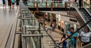
Hence the first key metric that you should be aware of is the portion of the product range that’s seen by the average visitor. In physical stores, this is typically very high, over 50% because they can scan the full range from the moment they walk through the front entrance and scan hundreds of products within a matter of seconds, although albeit at a distance.
In comparison, most online retailers would be lucky to have a mere 2% of their product range viewed on a typical visit. So of course, you have to show the full breadth in a fast and efficient manner because the customer needs to see all of what’s available.
The second point is that products with high stopping power go first. Stopping power refers to something interesting in the product itself or how it’s displayed, which encourages visitors to stop, investigate and enquire about the details of the product.
This idea of stopping power becomes a very important tool in the arsenal of every great merchandiser and it has the ability to turn a browsing visitor into a conscious shopper.
That means you should know which products have the most stopping power – that is a clear understanding of how many times these products are offered up to visitors and how successful that invitation actually is. If your customer is going to find what they’re looking for, they first need to have quick access to the entire catalogue, not a portion of it.
Logically Organise their products
Retailers have know for decades that the way they organise their product range impacts on sales. Brick and Mortar retailers invest a huge amount of care and attention into the arrangement of their stores through the efforts of Planners and Visual Merchandisers. They know that if customers can see how products are organized, then they are in a better position to browse, and therefore discover the products they’re looking for.
By placing similar products close to one another the retailer can help the visitor to find the right product quickly. Similar here could be any attribute that makes sense to the target market. It could be simplistic attributes of the product such as colour or category, but it could also be something less concrete like occasion or look. The important thing is that the customer understands the layout and can find their way to the right product.
Online retailers by comparison, don’t have the same ability to control the layout of their product range as they are restricted by the limitations of their eCommerce platform. As a result they tend to present products in a way that is easy for them, but in ways they would never dream of adopting in-store. For example, sorted by price or date of upload.
Without any meaningful structure in the product category, the visitor is left to trawl aimlessly through the website to find the right product. Creating a categories with over 20 products and no structure is literally the least the retailer can do. It’s the retail equivalent of heaping all the products in pile.
Instead online merchandisers should follow their in-store instincts and organise categories so that similar products are close together. A logical organization allows visitors to browse their own way and keeps them engaged as they can feel that they are moving methodically toward the perfect product. This way, they’re prepared to spend longer amounts of time doing it and more likely to actually find the product they need.
A logical organisation also tends to be the foundation of good Search Engine Optimisation (SEO) as the way the retailer chooses to organise the assortment should also be the way that their customers think about the product range.
There is one further benefit of a logical display. One of the things people fear and that actually prevents them from buying is the thought that there’s a better product out there. Good organization helps to ease the shopper’s mind. They can be confident that they have actually reviewed all the comparable products, that they don’t need to check a competitor and have in fact successfully completed their search. Such reassurance allows shoppers to turn into buyers.
DO’S AND DON’TS FOR ONLINE MERCHANDISING
- Do plan out you categories in the same way you would in-store
- Do use category pages to present products visually
- Don’t show more than 20 products on a page
- Don’t have more than one page of results
- Do use facets or other filters to help refine the search
- Don’t rely on industry terms or jargon, that your customers won’t understand
- Don’t assume that customers understand your terminology (Is a jumpsuit different to a romper? Who would know, each retailer has a different view)
Direct their visitors to the right product
In-store merchandisers understand that store layout determines the visitors path through the shop and it has great influence over what the visitor sees.
When people enter a physical store, they go through a process: they start off scanning the product range, they orient towards the products that are of interest and finally focus in on specific items. This is because most visitors enter a shop without a clear understanding of the exact product they want to buy. Instead, it is better to think of them as lost souls: who only have a vague intention to solve a poorly-defined need and have a lack of understanding about products are out there.
So I find it is better to think about online merchandising as a dance, one where the visitor simultaneously explores both their understanding of what options are available and also what they want.
This browsing dance has a couple of implications for merchandisers. The first is that during the Scan phase, the display of products needs to be balanced with reinforcement of the lifestyle aspects of the brand. Retailers in brick-and-mortar stores don’t just show the products. They show products alongside other promotional material which usually consists of images of happy, smiling, successful customers using their product. Essentially they are mixing up a range of communication to keep the customer interested and constantly reinforcing that this is a place that shares the same values as the person and that somewhere in the store has what they need.
Previously we have mentioned the importance of stopping power. There is another useful product metric called Attractiveness that I want to introduce. It’s the number of buyers of a product as a proportion of the number of people that inspected that product closely. The higher the Attractiveness, the more likely a shopper on a product page will go to add that product to their shopping cart.
Armed with the knowledge of stopping power and attractiveness, great retailers help visitors to navigate their product range. They put products with high stopping power in prominent positions in order to help visitors to Orientate, and to lead them to the part of the store where they can introduce the products with high attractiveness. By effectively combining the two, they put themselves in a good position to convert visitors to shoppers and shoppers to a buyers.
Online retailers by comparison tend to focus overly on the buy funnel, and don’t place sufficient care and attention on how visitors flow through their site. You should understand that every second of a visitor’s attention is valuable and expensive, quite literally. And so the visitors that don’t find a product they like, never show up in the buy funnel and that opportunity to sell is wasted.
In this regard, online retailers face an inherent challenge that brick-and-mortar doesn’t: that the visitor is only ever one click away from every other shop on the Internet. The moment that they feel they aren’t progressing towards a useful product, they abandon, so it is up to merchandisers to reassure them and help them towards their goal.
This article first appeared on www.stylefinder.ai
Read Seven Principles of Successful Online Merchandising Part 2


Follow us on social media